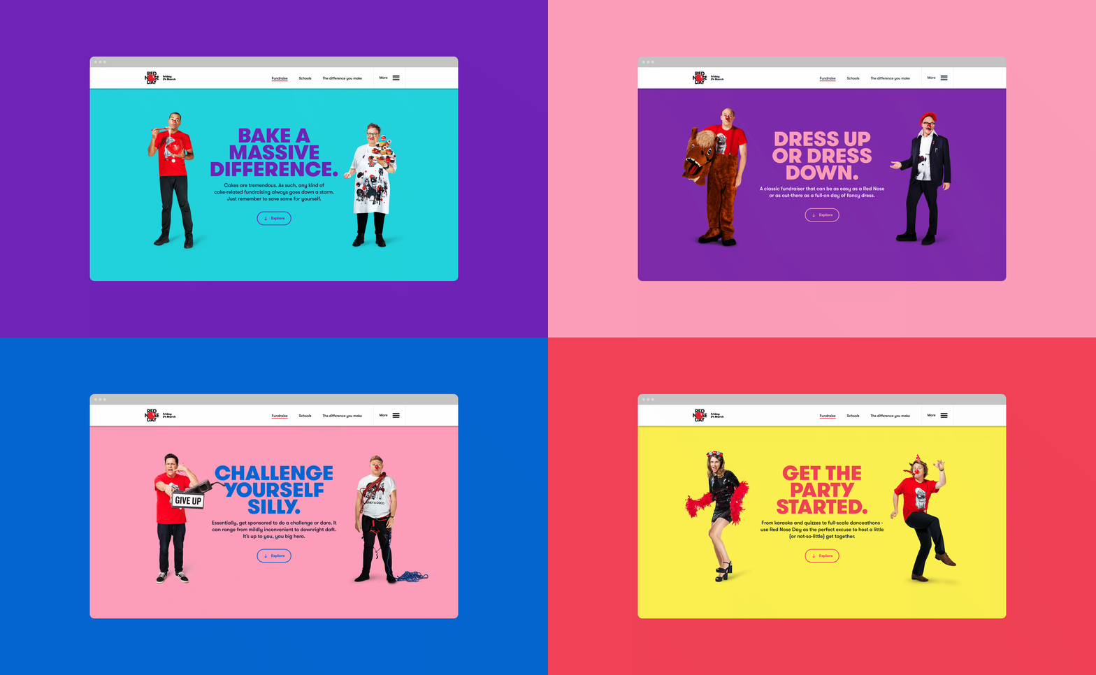
Campaign site design for RED N SE DAY, helping fundraisers to find the right tools
● ROLE
Senior Product Designer; as part of a team, working on creative concepts for Red Nose Day campaign, designing pages for its website, and leading on the development of website’s design system and responsive components.
● DISCIPLINES
UX/UI Design, Product Design, Art Direction
● CLIENT
Comic Relief
Red Nose Day is Comic Relief's lead fundraising campaign, running since 1985. "Make Your Laugh Matter" was the 2017’s creative concept, where the charity sought out to go back to its roots of raising money through comedy.
The main goal for the campaign was to recruit new fundraisers and improve conversion of fundraising kit orders, via a user-friendly and compelling responsive website. I was responsible for designing pages for the site's ‘Fundraise’ section.
● Working as part of an agile team, we were in frequent communication with the fundraising stakeholders from the kick-off. I took part in several collaborative working sessions to establish priorities, business needs, and user needs driven by data from the previous campaign.
Design System
After doing an audit of the previous campaign website and learning from what did/didn't work, we designed a more streamlined modular design system. I was heavily involved in the overall design with the rest of the team and oversaw the eventual build.
● The Content Wall component was significantly updated from the previous site. The main aim for this version was to display more concise, snappy signposting for key actions (like ordering fundraising kits), add more content variations and tweaking the user experience.
● The Content Wall was made of responsive, interchangeable blocks. Each block had specific copy counts, image templates for the Content team to use. They also had four different size layouts, for added flexibility.
● Working with the engineering team, we implemented the modular design system into a pattern library.
Visual Identity
We (the design team) developed a campaign visual identity, which revolved around silly jokes and one-liners. We matched this with a bold and playful colour palette, a friendly typeface and comedy photography.
● The four main fundraising categories were given names (stylised in GT Walsheim Black) and I designated each with colour pairings from the main palette.
● Portrait photography of new and veteran British comedians representing each category
Still Life Photography
Taking some inspiration from the comedian photography and under my direction, we took minimal shots of still-life items (and a lot of hands) that would represent each fundraising idea. These shots were used across the site and social media channels.
Final Designs


